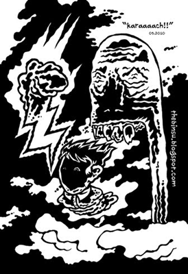
今回の作品はまたペンを手にとり、最初の段階で描きたいことを決めずに、描いているうちにできた絵です。フェルトペンに筆ペンを使いました。自分に与えた課題としては、色を塗らなくても全体的にメリハリがあって、絵の中の形がそれぞれすべてはっきり分かるように描くぐらいでした。今回のような作品で利用した、色もグレデーションもハッチング(一定の面を斜線で埋めるという陰影を付ける技法)も使わない描き方では恐れるのはそれぞれの形を目で区別するのが難しくなることと、全体のメリハリが保てないことです。それで、特に構図が最初の段階で決めないで自由に描いていく場合はその恐れについて非常に気を付けながら描いていく必要があります。その点で失敗しますと、面白い模様または幻覚状態を想起させる「サイケ調」の作品として認識してもらえるけれども絵の中の姿が見えてこないという抽象的な作品になることもあります。最初から抽象的な作品を作ると決めたら良いのですが、自然界(または空想の世界)の形象を具体的に表現したい場合は絶対に避けたいところですね。構図を最初の段階で決めてから描く場合は全体のデザイン性を調整したり、すべての形が見る方にとってはっきりと把握できるように位置、角度、大きさなどを調整することができますが、具体的な計画なしでペンで描く場合はそのような要素がすべて描きながら決まり、一つの形を描いてしまえば、取り消しはきかない描き方です。
This is another piece where I just picked up the pen and let the image take shape while drawing without first deciding on what I want to draw. I used a brush pen in addition to a felt tip pen. The only thing I really stuck to in terms of a plan was the goal of trying to make a drawing that is crisp overall and where each shape can be clearly understood without having to use any color at all. The danger of the kind of drawing I undertook this time, which is drawing without using any color, gradation, or hatching (a method of shading that involves filling up a plane with diagonal lines), is that shapes can be hard to distinguish from each other and the overall picture can lose its sense of crispness. That is why, especially when drawing freely without determining the composition up front, it is vital to pay close attention to that danger while drawing. If you fail in that, you could wind up with a piece that people enjoy as an interesting design or the kind of "psychedelic art" that is meant to invoke a hallucinatory state, but which is in the end an abstract piece which no discernable forms within it. Of course, that is just fine if your original goal is to create an abstract piece, but it is something you want to avoid completely if you want to render specific phenomena of the natural (or imaginary) world. If you determine the composition before starting work on a piece, you can adjust the overall design and elements like placement, angle, and size so that all shapes in the drawing are clearly comprehensible. But if you draw with a pen without any specific plan, all of those elements get decided during the drawing process itself. Once you draw a shape, there is no going back.
絵の中の形がそれぞれ区別できなくなるという問題の解決方法として、以前に黒をもっと入れてみなさいという意見をプロの漫画家からもらったこともあります。黒をもっと入れることで、メリハリができて、インパクト感があがるからとのことでした。たしかに、その意見をもらった時の絵は線ばかりで、ものがたくさん入っていたから何が何だか分かりにくい絵でした。色またはグレデーションを入れれば、その時の絵でも一つ一つの形がすぐ分かるかと思うのですが、白と黒だけで制作することを拘っていました。そのように拘っていた理由は絵のコピーをたくさん作り、色々な人にあげたかったのですが、コピーをしますと色が付いた作品のコピー代が高くなるという技術的な理由とグレデーションに頼りたくなかった美学的な理由でした。
As a way of dealing with the problem of not being able to discern the difference between shapes within a drawing, a professional cartoonist once told me that I should try putting in more black in my drawings. Putting more black in a drawing, I was told, will increase the clarity and add impact. And it is true that my drawings were pretty much all lines at that time, and since they were crowded with objects, it was hard to tell what was what. If I were to have added some gradation or color, I'm sure that each shape would have stood out clearly even in those drawings, but I was determined to work in only black and white. The reasons for this were the technical reason related to the high cost of color copies for drawings that I wanted to make lots of copies of to give to people and the aesthetic reason of not wanting to rely on gradations.
ミニョーラの「ヘルボーイ」 |
その意見を反映させたく、黒をもっと取り入れる挑戦を受けることにしました。いや、楽しむことにしました。なぜなら、その時とてもはまっていた漫画家の二人が作品の中に黒をたくさん使っていたことで、美術作品の制作方法をすでに考え直し始めていましたからです。
I decided I really wanted to reflect that advice in my work, and so I took up the challenge of adding more black. Actually, I sort of relished the challenge. The reason for that is that at the time two cartoonists in particular that I was really into were using lots of in their work, and as a result I was beginning to rethink my approach to creating art altogether. |
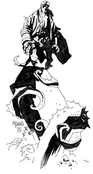 |
Artwork copyright Mike Mignola |
まずはその時はまっていた漫画家の中で、「ヘルボーイ」という、映画化もされた漫画のシリーズで有名なアメリカの漫画家マイク・ミニョーラの絵をたくさん見ることにしました。ミニョーラを選んだのは、描くイラストや漫画の黒の入れ方は非常に面白く、インパクト感が高いからです。それから研究の材料として使ったのは「シン・シティー」で有名な漫画家「フランク・ミラー」の作品でした(「シン・シティー」も「ヘルボーイ」と同様に、映画化されました。しかも、「パルプ・フィクション」で有名な監督クエンティン・タランティーノも力を貸しました)。アメリカの漫画業界では黒の空間のインパクト感を勉強したければ、まずこの二人の作品をたくさん見れば良いと言われています。
First I set about looking at lots of work from Mike Mignola, one of the two cartoonists I was into at the time, who is famous for his comic book series "Hellboy" that was also made into a movie. I chose him because his method of including black in his illustrations and comics is incredibly interesting and imbues the work with a high level of impact. The second body of work I used for research was stuff from Frank Miller, the cartoonist famous for "Sin City" (Like "Hellboy," "Sin City" was also made into a movie, and was great in that it featured the input of director Quentin Tarantino of "Pulp Fiction" fame). In the American comic book industry, it is generally said that if you want to study the sense of impact of black space, you should first look at lots of work by these two artists.
ミニョーラとミラーの作品をたくさん見ていると気になったのはまず、絵の中の光源が描かれている人々の後ろにあるかのように、その体の内部の影が体の中心にある絵が多いことでした。一方、私は体の内部の影を表現する場合、体の中の外側(右側もしく左側、または上の方か下の方)に集まっている状態で昔から描くことが多いです。ミニョーラとミラーの作品の多くでは、描かれている形の中心に影が置かれていることにより、インパクト感及び物理的な重みがとても感じます。
|
ミラーの「シン・シティー」 |
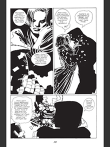 |
Artwork copyright Frank Miller |
Looking at a lot of works by Mignola and Miller, the first thing I noticed was that there were lots of drawings where the shadows on the bodies were placed in the center of the bodies as if the light source of the drawing was coming from behind the figures in the drawing. In my drawings on the other hand, I have always drawn shadows as congregating on the outer areas of the body (to the left side or right, or to the upper or lower side) when depicting shadows on the body. In a lot of drawings by Mignola and Miller, shadows placed on the center of the depicted forms imbue the works with a sense of impact and a physical weight.
そのような重みが表現されている絵を初めて意識したのは学生時代のことでした。私と同じ裸婦デッサンの授業を受けている同級生が木炭やコンテ・クレヨンでモデルの姿の中心に影を付けて、重みを加えていました。そのころ、そのような描き方も可能なんだなとすごいことを発見した気持ちと、私には真似できないという自信のなさを感じたことを今でも覚えている。見た目としては素晴らしい表現方法だと思いながら、自然の光源を無視して、光の物理的な規則を違反することに近い行為でもあると思っていました。でもやはり、心の奥深くにいつかそのような自由さをもって絵を描きたいと思っていたと思います。憧れでした。
The first time I became aware of drawings imbued with this type of weight was in my student days. A fellow student in one of my life drawing classes would put in shadows with charcoal and conte crayons in the center of the form of the model to add weight. To this day, I still remember the feeling of having made the incredible discovery that this type of rendering was possible and the lack of confidence in myself to try it. Even though I thought that in terms of appearance, this was a wonderful method of depiction, I also felt that it was almost like ignoring the natural light source and going against the physical rules of light. But I think that, deep within my heart, I harbored the desire to draw with that kind of freedom. It was something I really looked up to.
ですから、社会人になってからそのような重みを加える技法を挑戦してみることになったのは何かの縁かもしれません。そして今は、そのようなインパクト感が高い重みを作品に持っていくのがとても楽しくなり、たまりません。自由に描いているうちにメリハリがなくなる問題の解決方法として考えるようになった影の表現の仕方は今、絵を描く楽しみをとても増やしてくれています。大感謝です!
So maybe there is some kind of significance to me taking on the challenge of adding that kind of weight to my drawings years after graduating. And now, bringing this kind of weight with its high level of impact into my drawings is so much fun, I'm completely addicted. This way of rendering shadows that I started thinking about as a method of solving the problem of losing clarity while drawing free-form wound up increasing the fun of drawing for me. I am really thankful! |